Plotting
[1]:
import prodimopy.read as pread
import prodimopy.plot as pplot
import matplotlib.pyplot as plt

# load the default style for the plots
pplot.load_style()

plt.rcParams['figure.dpi'] = 100 # set the resolution of the plots, useful to scale the figure size in a notebook
INFO: Load prodimopy mplstyle from package.
Read in a model
[2]:
# Read a model from a directory. Adapt this to your model
model= pread.read_prodimo("~/MODELS/prodimopy/TTauri_new")

# get some information about the model
print(model)
READ: StarSpectrum.out ...
READ: RTinterpolation.out ...
READ: Species.out ...
READ: ProDiMo.out: 100%|██████████| 1600/1600 [00:00<00:00, 19330.43it/s]
READ: FlineEstimates.out: 100%|██████████| 51174/51174 [00:00<00:00, 385887.85it/s]
READ: Elements.out ...
READ: dust_opac.out ...
READ: dust_sigmaa.out ...
READ: line_flux.out ...
READ: SED.out ...
READ: SEDana.out ...
READ: image.out ...
READ: Parameter.out ...
READ: C13O_C12O_ratio.out ...
INFO: Reading time:  0.48 s

Info ProDiMo.out:
NX: 40 NZ: 40 NSPEC: 199 NLAM: 25 NCOOL: 111 NHEAT: 119
p_dust_to_gas: 0.01
Create a plotting instance
[3]:
# With pp we make all our prodimopy plots. None is used as we do not want a pdf output
pp=pplot.Plot(None)
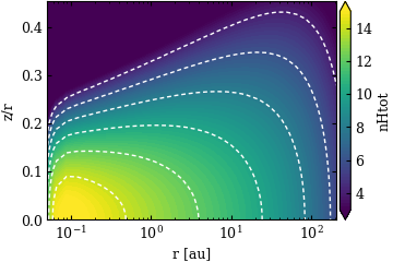
Plot the structure
[4]:
# gas number density, for many fields it is only necessary to provide the filed name, a nice label for the colorbar and the unit is then selected.
# one can always overwrite this (see next example)
fig=pp.plot_cont(model,model.nHtot,label="nHtot",zlim=[1e3,1e15],extend="both",cb_format="%.0f")

# linear in x an z
fig=pp.plot_cont(model,model.nHtot,label=r"log n$_{H}$ [cm$^{-3}$]",zlim=[1e3,1e15],extend="both",cb_format="%.0f",xlog=False,zr=False,title="linear in x and z")


# Simplified way of plotting a field, here the gas temperature
fig=pp.plot_cont(model,"tg")
PLOT: plot_cont ...
PLOT: plot_cont ...
PLOT: plot_cont ...


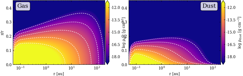
Fancy plot for dust and gas
[5]:
# use subplots to plot the gas density and dust density next to each other
fig,axs=plt.subplots(1,2,figsize=(9,2.7))

# This can be very useful is one wants to have multiple plots with a similar style
# Here we also change the color map
constyle={"cmap":"plasma","extend":"both","cb_format":"%.1f","zlim": [3.e-19,3.e-12]}

fig=pp.plot_cont(model,model.rhog,label=r"log $\rho_{gas}$ [g cm$^{-3}$]",ax=axs[0],**constyle)
fig=pp.plot_cont(model,model.rhod,label=r"log $\rho_{dust}$ [g cm$^{-3}$]",ax=axs[1],**constyle)

# we do not need the z/r axis in the second plot
axs[1].set_ylabel("")

# place some text boxes on the plots
props = dict(boxstyle='round', facecolor='white', alpha=0.8)
axs[0].text(0.05, 0.95, "Gas", transform=axs[0].transAxes, fontsize=14,
            verticalalignment='top', bbox=props)

ret=axs[1].text(0.95, 0.95, "Dust", transform=axs[1].transAxes, fontsize=14,
                verticalalignment='top', horizontalalignment="right", bbox=props)
PLOT: plot_cont ...
PLOT: plot_cont ...
Line Origin plots
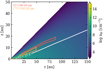
One very useful feature of ProDiMo is that it can show you from where line emission or continuum emission originates.
[9]:
# First we select a Line we would like to plot, for the origin we need the line estimates from ProDiMo
# This is just to check if it is really there
line=model.getLineEstimate(ident="CO",wl=1300.0)
print(line)

# We want to show also the CO ice line Assume a CO ice line at 25 K
cont=pplot.Contour(model.td,[25],label_fmt=r"T$_d$ = %.0f K",colors="white",linestyles="-",showlabels=True)


fig=pp.plot_line_origin(model,[["CO",1300],["C18O",1300]],field=model.nHtot,
                        label=r"log n$_{H}$ [cm$^{-3}$]",zlim=[1e3,1e15],extend="both",cb_format="%.0f",zr=False,xlog=False,
                        xlim=[None,150],ylim=[None,50],
                        showContOrigin=True,showRadialLines=False,
                        showztauD1=False,
                        oconts=[cont]) # this adds an additional contour
LineEst: CO               wl=  1300.403645 μm  flux= 2.049e-20 W/m^2  (up=    3 low=    2)
PLOT: plot_cont ...
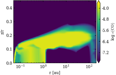
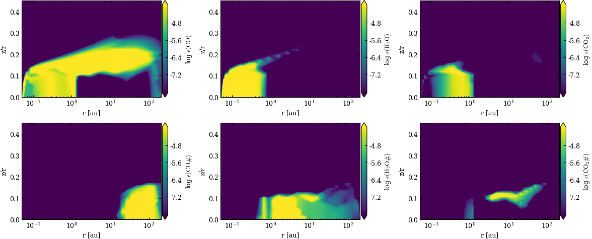
Plotting chemical abundances
Chemical abundances can be also plotted using plot_cont (same features) but there are also come convenience methods.
[7]:
fig=pp.plot_abuncont(model,"CO",zlim=[2.e-8,2.e-4],extend="both",cb_format="%.1f",contour=False)


# Plotting grid with various abundances
# in the first row we want the gas phase abundances in the bottom row the ices
fig=pp.plot_abuncont_grid(model,["CO","H2O","CO2","CO#","H2O#","CO2#"],nrows=2,ncols=3,
                          zlim=[1.e-8,1.e-4],extend="both",contour=False)
PLOT: plot_abuncont ...
PLOT: plot_abuncont_grid ...
[1e-08, 0.0001]
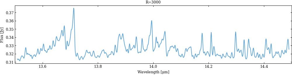
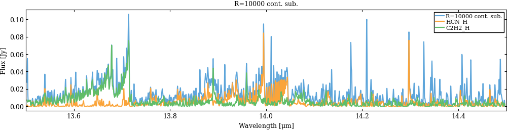
Making a spectrum in the mid-infrared
ProDiMo provides line estimates for all lines that are considered in the heating/cooling balance, with those one can make a simple 1D spectrum. As you will see some convenience methods in prodimopy are missing for plotting such spectra. If you make a nice one just let us know.
[8]:
# We generate the spectrum
wlrange=[13.5,14.5]
spec=model.gen_specFromLineEstimates(wlrange=wlrange,unit="Jy",specR=3000)
specHRnocont=model.gen_specFromLineEstimates(wlrange=wlrange,unit="Jy",specR=10000,noCont=True)

for spec,label in zip([spec,specHRnocont],["R=3000","R=10000 cont. sub."]):
  # now we make a simple plot of the spectrum ... there is now plot function for that in prodimopy
  fig,ax=plt.subplots(figsize=(12,2.5))
  ax.plot(spec[0],spec[1],label=label)
  ax.set_xlim(wlrange)
  ax.set_xlabel(r"Wavelength [$\mu$m]")
  ax.set_ylabel("Flux [Jy]")
  ax.set_title(label)

# Now we want to plot some individual lines
for ident in ["HCN_H","C2H2_H"]:
  # In the last figure we can now also just overplot the line estimates for HCN
  spec=model.gen_specFromLineEstimates(ident=ident,wlrange=wlrange,unit="Jy",specR=10000,noCont=True)
  ax.plot(spec[0],spec[1],label=ident)

ax.legend()
INFO: gen_specFromLineEstimates: build spectrum: 100%|██████████| 3727/3727 [00:00<00:00, 102108.99it/s]
INFO: gen_specFromLineEstimates: convolve spectrum ...
INFO: time:  0.09 s
INFO: gen_specFromLineEstimates: build spectrum: 100%|██████████| 3727/3727 [00:00<00:00, 112829.37it/s]
INFO: gen_specFromLineEstimates: convolve spectrum ...
INFO: time:  0.05 s
INFO: gen_specFromLineEstimates: build spectrum: 100%|██████████| 1251/1251 [00:00<00:00, 107115.94it/s]
INFO: gen_specFromLineEstimates: convolve spectrum ...
INFO: time:  0.03 s
INFO: gen_specFromLineEstimates: build spectrum: 100%|██████████| 1586/1586 [00:00<00:00, 95374.29it/s]
INFO: gen_specFromLineEstimates: convolve spectrum ...
INFO: time:  0.04 s
[8]:
<matplotlib.legend.Legend at 0x7786d86b3380>